Flow and the Chart: AXTI Case Study

Most options flow analysis looks at trades in isolation. A large call purchase. An unusual put sale. A single print that stands out from the noise. Interesting but incomplete.
The more instructive cases are the ones where flow builds across multiple sessions, using multiple instruments, in a name where the chart is already telling a story. AXTI in the second week of March 2026 is one of those cases.
Over three trading days, roughly $6.2 million in structured options activity accumulated in a stock that was already showing every technical sign of institutional accumulation. Flow and chart were saying the same thing but in different languages.
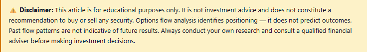
Monthly: The monthly golden cross is in place - the 8 month EMA crossing above the 21 month EMA for the first time in years. Monthly volume on the breakout bar: 111.48 million shares against a 30-month average of 33.65 million. Incredible monthly volume, only halfway into the month and already 3 x the average monthly volume on the month that produced a 26-year closing high. Volume of that magnitude on a monthly bar does not happen by accident. It is institutional participation at a scale that takes months to build and is rarely visible until it is already well underway.
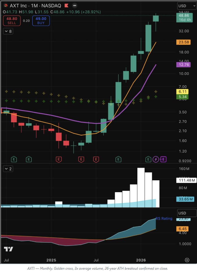
Weekly: A golden cross formed in December 2025. Since then, a steady uptrend with the most recent weekly bars the tallest on the chart — volume running at double the 30-day average and accelerating. Not a retail momentum spike. Sustained, repeated buying over weeks.
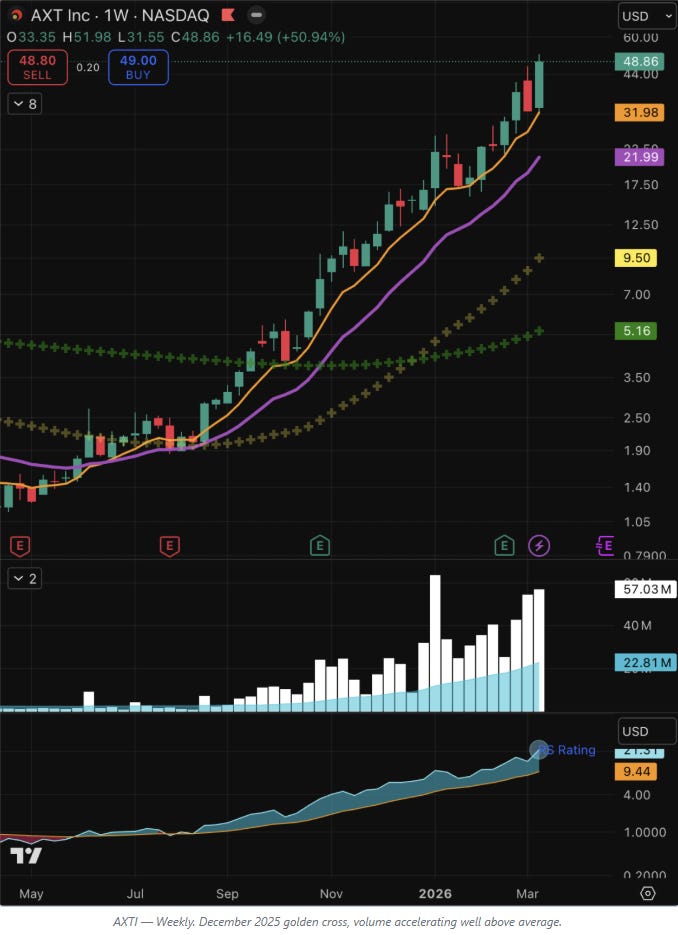
Daily: 8 and 21 day EMAs in upward slope and properly stacked. Price holding above key moving averages in a broad market environment that was testing most names. Volume on the March move clearly above the daily average.
The ATH context: On the surge into March 13, AXTI made a new all-time high on the intraday wick and confirmed it on the close. A 26-year high, breached intraday and held through the session, on 3x average monthly volume. The monthly chart makes this visible in full: a single enormous candle pushing through a level not seen since the late 1990s, with the RS line accelerating and the golden cross freshly formed. That is a stock being re-rated, not a stock being traded.
The relative strength reading across all timeframes tells the same story. In a market under broad pressure, AXTI was not just holding, it was making all-time highs. That divergence is one of the clearest signals of genuine institutional interest you will find on a chart.
The chart was already a compelling standalone case. The options flow added a second source of evidence, built quietly over three days, pointing in exactly the same direction.
The Flow — Three Days, Three Instruments
Day 1 - Monday 10 March. Stock at $43–44.
Two call purchases in the first twenty minutes of the session:
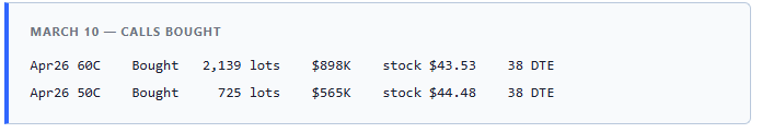

Two things stand out. First, the 60C. With the stock trading at $43.53, the April 60 strike is approximately 38% out of the money. This is not a near-term directional bet, it is a statement that the buyer expects a significant move in the next five weeks. Second, the 50C adds a more measured layer of the same view. Together, $1.46M in call exposure established at the open.
Day 2 - Tuesday 11 March. Stock at $42, slipping.
The stock pulls back slightly from Monday’s levels. The response in the options market is striking:
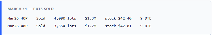

7,554 lots of near-expiry March puts sold at the 40 strike = $2.5M of premium collected in twelve minutes. With nine days to expiry and the stock at $42, this is an aggressive, short-dated position. The seller is effectively saying: I will buy AXTI at $40, if required. And I am confident enough to do it with puts that expire in a week and a half.
When a stock dips and the options market responds with large put sales rather than put purchases, that is informed money stepping in to establish a floor, not retail panic or hedging. It is one of the more reliable reads in flow analysis.
Day 3 - Thursday 13 March. Stock at $50–51, ripped.
AXTI surges. In two days the stock has moved from $42 to $50 - a 19% move, testing the prior all-time high. The options market is active at the open:
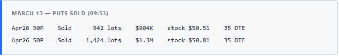

$2.2M in put selling at the 50 strike within seconds of each other. The same instrument used on Tuesday at the 40 strike is now being sold at the new level, anchoring $50 as the floor and signaling the thesis has not changed, only the reference point.
An hour later, the picture becomes more nuanced:
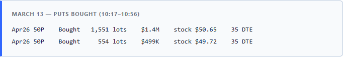

$1.9M of puts bought at the same strike, same expiry, the other side of the trade appearing within the hour. Same instrument, opposite direction. This is the options market doing what it always does at significant levels: attracting both bulls and bears simultaneously. One participant sells puts to establish a floor, another buys them for protection, possibly hedging a long stock position acquired on the move, possibly a different view entirely.
The net at the April 50P strike on March 13: 2,366 lots sold versus 2,105 lots bought. Barely net bullish. The dominant signal remains the call buying on March 10 and the aggressive put selling into weakness on March 11. March 13 is a contested level - which is exactly what you would expect at a 26-year all-time high.

What the Structure Tells You
The sequence matters as much as the individual trades. Three separate expressions of the same view, each appropriate to the market conditions of its day:
Monday: Calls bought as the position is initiated. Far OTM strikes signal a large move is expected.
Tuesday: Stock dips. Rather than buying calls into weakness, which would be the naive approach, the operator sells puts. This achieves two things simultaneously: it collects premium to fund the overall position, and it publicly commits to a price floor. Put selling of this size and duration is not speculation. It is conviction.
Thursday: The move validates. Rather than exiting, they sell puts at the new higher level, anchoring $50 and signaling that the thesis has not changed, only the reference point.
This is how a position is built by someone who knows what they own and why. Not a single punt. A structured accumulation in options that mirrors exactly what the chart shows in equity volume, sustained, deliberate, institutional.
Key Technical Levels
For those watching AXTI, the chart offers clearly defined reference points across timeframes. Theses are the levels where flow and chart would need to align to confirm continuation.
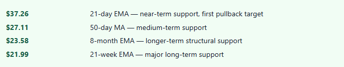
A move straight up from here is possible but rarely how accumulation plays out. The more probable path involves at least one test of a moving average - the 21-day EMA at $37.26 being the first logical candidate. That kind of consolidation, in a stock with this technical structure and this options backdrop, is typically where the chart answers the question.
The flow does not remove the need for technical discipline. It adds context and in AXTI’s case, the weight of evidence; flow, volume and chart structure: all points in the same direction.
Why This Appears in the Dashboard
All six trades passed the Options Intelligence filters - minimum notional, minimum price, structure correctly identified. The two distinct categories - Calls Bought and Puts Sold - were classified separately and accurately. In the live feed they arrived in real time, labelled, sized, and directionally color-coded as they crossed the tape.
In the dashboard they sit as a permanent searchable record. Filter by AXTI, sort by date, and the three-day sequence is immediately visible. Set sentiment to bullish and the picture sharpens further - every piece of flow in this name, in this window, pointing the same direction.
That is what the platform is built to discover. The interpretation — flow and chart together — it is the work you bring to it.